Where One World Gently Becomes Another
Some artworks hold our attention not because they depict a dramatic subject, but because they make change visible. A pale color slowly deepens. A darker field opens into light. A circle, doorway, horizon, or band of atmosphere suggests that the image is moving from one condition into another. Nothing in the artwork may be literally in motion, yet the viewer feels a passage taking place.
This is the quiet power of transition in art. A transition is more than a shift in color, shape, or space. It is the moment when one visual state begins to become something else. In abstract art, especially, this in-between quality can carry much of the emotional meaning. The artwork does not have to explain change; it lets us experience change through looking.
The Meaning of the Threshold
One useful word for this experience is liminal, from the Latin limen, meaning threshold. A liminal space exists between an ending and a beginning, like a hallway, bridge, shoreline, doorway, sunrise, or twilight. These places feel meaningful because they do not fully belong to either side. They ask us to pause before arrival. In art, that pause can become surprisingly expressive.
The Gradient as a Passage
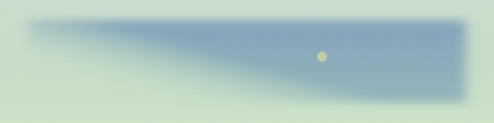
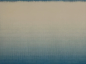
A two-color gradient is one of the clearest ways to create this feeling. In a gradient, one color gradually transforms into another without a hard boundary. Midnight blue may soften into pale gold. Deep green may fade toward ivory. Charcoal gray may dissolve into warm white. The eye cannot point to the exact place where one color stops and the next begins. Instead, it follows a continuous passage.
That gradual movement is why gradients work so well in contemplative and symbolic art. A sharp contrast can feel forceful, but a soft transition asks for slower attention. It invites the viewer to notice small changes in tone, temperature, and mood. Blue moving toward white may suggest distance, clarity, or morning mist. Amber shifting into crimson may evoke memory, warmth, or the last light of evening. Green softening into gray can suggest renewal held in quiet reserve.
Restraint and Emotional Depth
The emotional depth comes partly from restraint. With only two colors, the viewer becomes more aware of what happens between them. Every slight variation matters. The colors do not simply sit beside one another; they affect one another. A yellow field may feel more luminous beside violet. A blue may become more meditative as it sinks toward gray. In this way, the gradient becomes a visual conversation rather than a decorative effect.
Transitions in Space and Form
The same idea applies to spaces and forms. A doorway matters because it joins two rooms. A shoreline matters because water and land meet there. Twilight matters because it belongs to neither day nor night. In each case, meaning gathers at the point of transition. The subject is not only the place itself, but the relationship between what has been left behind and what may be entered next.
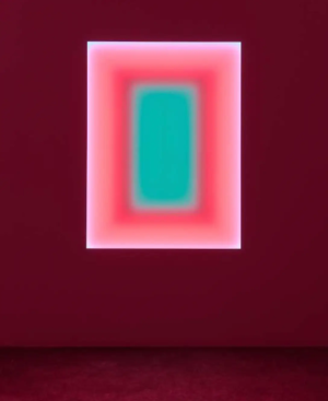
Composition can strengthen that effect. A centered shape may feel steady, while an off-center form can suggest hesitation or movement. A vertical arrangement may imply ascent, descent, or a slow passage through atmosphere. Even a simple abstract image can begin to feel narrative when its colors and forms guide the eye from one state of being toward another.
Why Contemporary Artists Return to Transition
This is why contemporary artists often return to thresholds, soft fields, and atmospheric color. These images offer calm without becoming empty. They create room for reflection in a fast-moving visual culture. Instead of demanding an immediate response, they reward patient looking. The viewer completes the work through memory, association, and feeling.
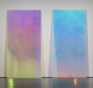
In Artful Transitions, the two-color gradient becomes more than a background. It becomes a metaphor for passage. The artwork asks us to see change not as a rupture, but as a gradual unfolding. One color gently becomes another, and in that graceful movement, the image reminds us that beauty is often found between fixed destinations.
References
Albers, Josef. Interaction of Color. Yale University Press, 1963.
Augé, Marc. Non-Places: Introduction to an Anthropology of Supermodernity. Verso, 1995.
Gombrich, E. H. Art and Illusion. Princeton University Press, 1960.
Itten, Johannes. The Art of Color. John Wiley & Sons, revised edition, 1973.
Turner, Victor. The Ritual Process: Structure and Anti-Structure. Aldine Transaction, 1969.